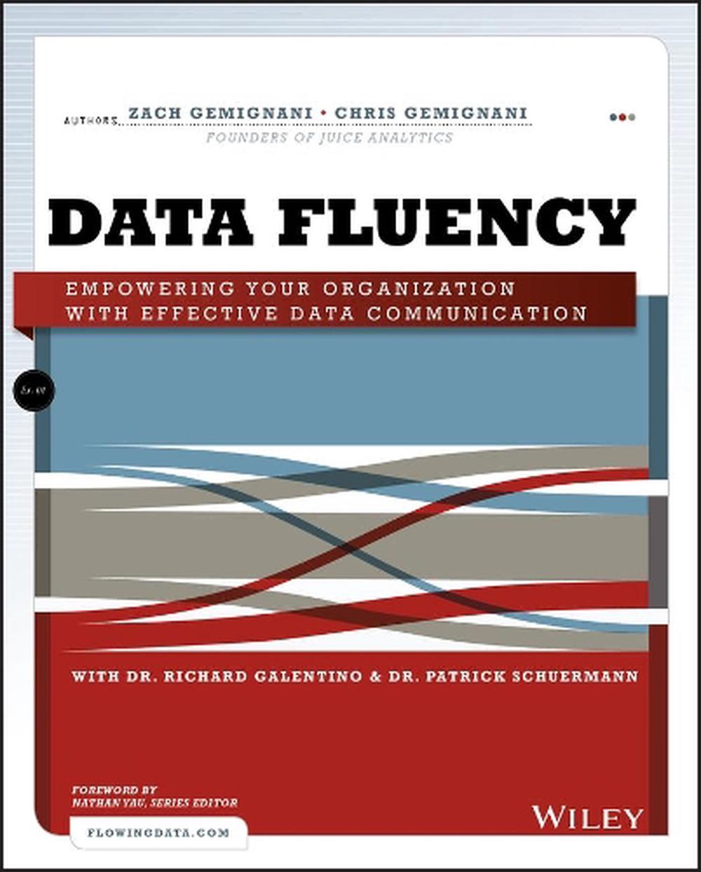
Analytical data is a powerful tool for growing companies, but what good is it if it hides in the shadows? This book shows you the tools and strategies for getting the job done right. It helps you to learn the practices of data presentation and the ways that reporting and dashboards can help organizations effectively gauge performance.
A dream come true for those looking to improve their data fluency
Analytical data is a powerful tool for growing companies, but what good is it if it hides in the shadows? Bring your data to the forefront with effective visualization and communication approaches, and let Data Fluency: Empowering Your Organization with Effective Communication show you the best tools and strategies for getting the job done right. Learn the best practices of data presentation and the ways that reporting and dashboards can help organizations effectively gauge performance, identify areas for improvement, and communicate results.
Topics covered in the book include data reporting and communication, audience and user needs, data presentation tools, layout and styling, and common design failures. Those responsible for analytics, reporting, or BI implementation will find a refreshing take on data and visualization in this resource, as will report, data visualization, and dashboard designers.
Data Fluency: Empowering Your Organization with Effective Communication focuses on user experience, making reports approachable, and presenting data in a compelling, inspiring way. The book helps to dissolve the disconnect between your data and those who might use it and can help make an impact on the people who are most affected by data. Use Data Fluency today to develop the skills necessary to turn data into effective displays for decision-making.
Zach Gemignani is co-founder and CEO of Juice Analytics. He works with companies with companies to build analytics-savvy organizations and develop analytical tools that focus on getting the human elements right. Chris Gemignani is also co-founder of Juice Analytics and previously Chris was a VP analyst at Citibank and PNC bank. Dr. Richard Galentino is CEO of Stratable, Inc., a strategic planning and organizational development consulting firm. Dr. Patrick Schuermann is a Harvard International Education Policy Fellow. Nathan Yau (Consulting Editor) has a PhD in statistics and is a statistical consultant helping clients make use of their data through visualization. Nathan is the author of the best-selling visualization books, Visualize This and Data Points.
POWERFUL DATA THAT GETS RESULTS There is a colossal disconnect between the volumes of data collected by organizations and the people who might make use of it. This gap can be bridged by creating focused and thoughtful data presentation tools, including reports, dashboards, visualizations, or key metrics. Together, these tools and capabilities lead to data fluency, the ability to use the language of data to exchange and explore ideas within your organization. Conquer the different challenges organizations face with data reporting and communication Find a fit between audience needs and the right data presentations Design effective data presentations and tools, including choices in visualizations, layout, and styling Shape the culture of your organization to encourage the use of data in daily activities Build an ecosystem where quality data presentation solutions can reach their audiences with geometry, traditional charts, maps, color, art, and even humor Learn more by visiting the companion website at
This item is eligible for free returns within 30 days of delivery. See our returns policy for further details.